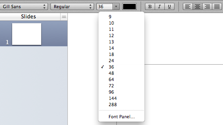
This is the font size selector from Keynote. If you’re coming from a word processor program and using Keynote for the first time, this probably feels familiar to you. But it’s totally wrong for the context: putting words on the screen for a presentation. In this context, the bigger the text the more readable it is to viewers.
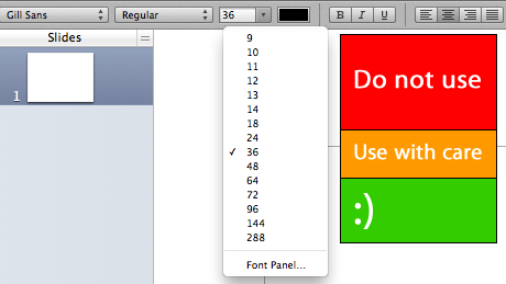
I think there are a few ways this is facilitating bad behavior. First off, nearly 2/3rds of the options are illegible in most presentations:

The order of the items also emphasizes smaller sizes by putting them closer to the dropdown arrow. To get to reasonable sizes, you have to travel farther.
I think the list should be in reverse order and eliminate smaller than 18. If people really want to shoot themselves in the foot and cause eyestrain, they can enter smaller values directly.
