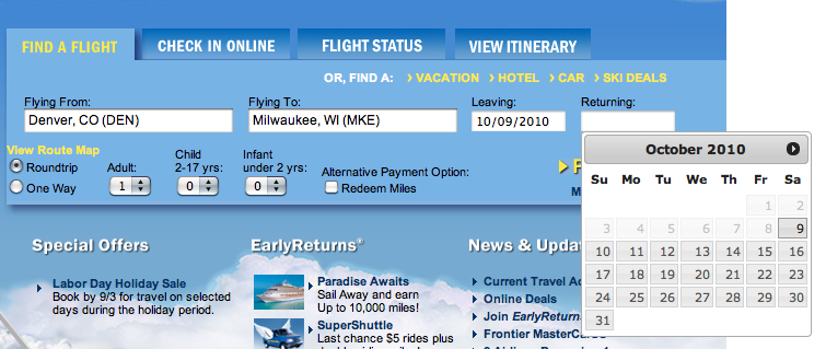
Remember when Dustin Curtis got a bunch of hype for his design critique of American Airlines’ web site? With unlimited free time, I’d do the same for Frontier. My favorite airline, my least favorite airline web site. I use the form pictured A LOT and it has a couple quirks that bother me.
- The date boxes don’t allow you to type dates directly, you have to select from the popup calendars (SLOW)
- If you type too fast in the location boxes and the autocomplete doesn’t come up, but you search anyway, it will tell you there’s an error even though the box contains a valid airport code.
Both of these situations are because of a heavy emphasis on making them learnable, at the expense of being usable. Test your apps for both learnability (good first-time experience) and usability (stays out of your way when used repeatedly). It’s difficult to achieve but the payoff is worth it.