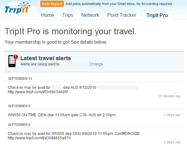
TripIt has always received kudos for the brilliant UX around importing trip information simply by instructing you to forward confirmation emails to them. It’s been described as magic, and it works as advertised. The beauty of this experience has always been attributed to genius. Unfortunately I’m starting to think there’s only one genius at TripIt (or the good designers left) and they’re not working on TripIt Pro. Case in point: its inexcusable that a link can be put on a web page that’s not clickable. But the bigger issue is re-using the SMS alert text on the web. It feels incomplete and out of place.
TripIt nailed the create itinerary feature so well that I’ll continue to use it despite incomplete features like this. But I’m disappointed. I expect more from them, especially once I paid for the service.

